Brand
Guidelines
The complete guide to TidyHire’s visual identity, logo system, typography, and creative brand assets.
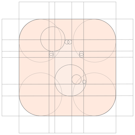
Logo
The TidyHire logo consists of the signature “t” symbol and the “tidyhire” wordmark. The horizontal logo is the primary brand identifier, while the symbol may be used independently where a compact brand presence is required.
The logo should primarily appear in its original brand colors on black or white backgrounds. Approved monochrome variations may be used in specific applications across different backgrounds, provided the appropriate logo asset is selected to ensure visibility and contrast. Always use the approved logo files without modifying their proportions, colors, or composition.
Correct Use Cases of Logo
Primary symbol on dark
Primary symbol on light
White monochrome symbol
Black monochrome symbol

Primary logo on dark

Primary logo on light
White monochrome logo

Black monochrome logo
Logo Usage Guidelines
Primary logo variations should be prioritized across all brand communications. Monochrome variations are intended for selective use when the primary logo is unsuitable for the background or application. They may be placed on any background that provides sufficient contrast and legibility, using only the appropriate approved logo assets.
Incorrect Use Cases of Logo

Replacing the original wordmark font

Stretched or compressed logo

Changing original orientation

Cutting or obscuring logo elements

Replacing the original wordmark font

Stretched or compressed logo

Using unapproved brand colors

Blur, gradients, shadows or outlines
Colors
Primary Colors
TidyHire’s visual identity is built around three core solid colors: Tidy Black, Tidy White, and Tidy Orange. Black and white provide the high-contrast foundation for clean, minimal layouts, while Tidy Orange is used intentionally as a focused primary accent to highlight critical actions and key brand moments. All surfaces use solid tones without decorative gradients to ensure immediate clarity, hierarchy, and accessibility.
Secondary Colors
The secondary palette (Emerald, Sky, Purple, Pink, and Red) adds functional flexibility for system states, analytics, metrics, tags, and product illustrations. They are applied selectively as solid accents and should never compete with Tidy Orange or dilute the primary monochrome hierarchy.
Usage Proportions
Black + White — Foundation & structure (80%)
Tidy Orange — Primary accent & actions (15%)
Secondary Colors — Supporting functional accents (5%)
Typography
TidyHire combines Instrument Serif, Inter, and Geist Mono to create a balance between editorial character and modern technology. Instrument Serif brings personality and distinction to headlines, while Inter keeps supporting content clear and easy to read. Geist Mono is used selectively for numbers, labels, data, and technical details.
Instrument Serif Used for large headlines, statements, and key brand moments. It gives TidyHire a distinctive and sophisticated character.
Inter Used for supporting headlines, body copy, UI, CTAs, and everyday communication. It provides clarity and consistency across digital and marketing touchpoints.
Geist Mono Used sparingly for numbers, labels, metrics, tags, and data-focused content. It adds a subtle technical character without overwhelming the design.
Instrument Serif
Google FontsAa Bb cc Dd Ee Ff Gg Hh Ii Jj Kk Ll Mm Nn Oo Pp Qq Rr Ss Tt Uu Vv Ww Xx Yy Zz 0123456789
Inter
Google FontsAa Bb cc Dd Ee Ff Gg Hh Ii Jj Kk Ll Mm Nn Oo Pp Qq Rr Ss Tt Uu Vv Ww Xx Yy Zz 0123456789
Geist Mono
Google FontsAa Bb cc Dd Ee Ff Gg Hh Ii Jj Kk Ll Mm Nn Oo Pp Qq Rr Ss Tt Uu Vv Ww Xx Yy Zz 0123456789
Illustrations
TidyHire illustrations should feel clean, modern, dimensional, and purposeful. Use simple compositions, strong contrast, and generous negative space to communicate an idea without adding visual noise.
Illustrations should support the message, not compete with it. Use TidyHire’s core colors and visual language consistently, with orange and the secondary palette used as intentional accents.
Backgrounds
TidyHire backgrounds and decorative surfaces provide depth, dimensionality, and architectural structure without distraction. Use kinetic dot meshes, particle surfaces, and dashed layout frames intentionally to establish a technological yet refined feel.
Background textures should remain calm and atmospheric, giving content room to breathe while grounding the product experience in a unified, tactile design language.
Brand Kit
Everything you need to design and build with the TidyHire visual identity — including the full logo set (SVG & PNG) and complete brand font families.